Inflation-Adjusted Earnings Yield
If you are both valuation-focused and inflation-aware, equity prices are out of this world.
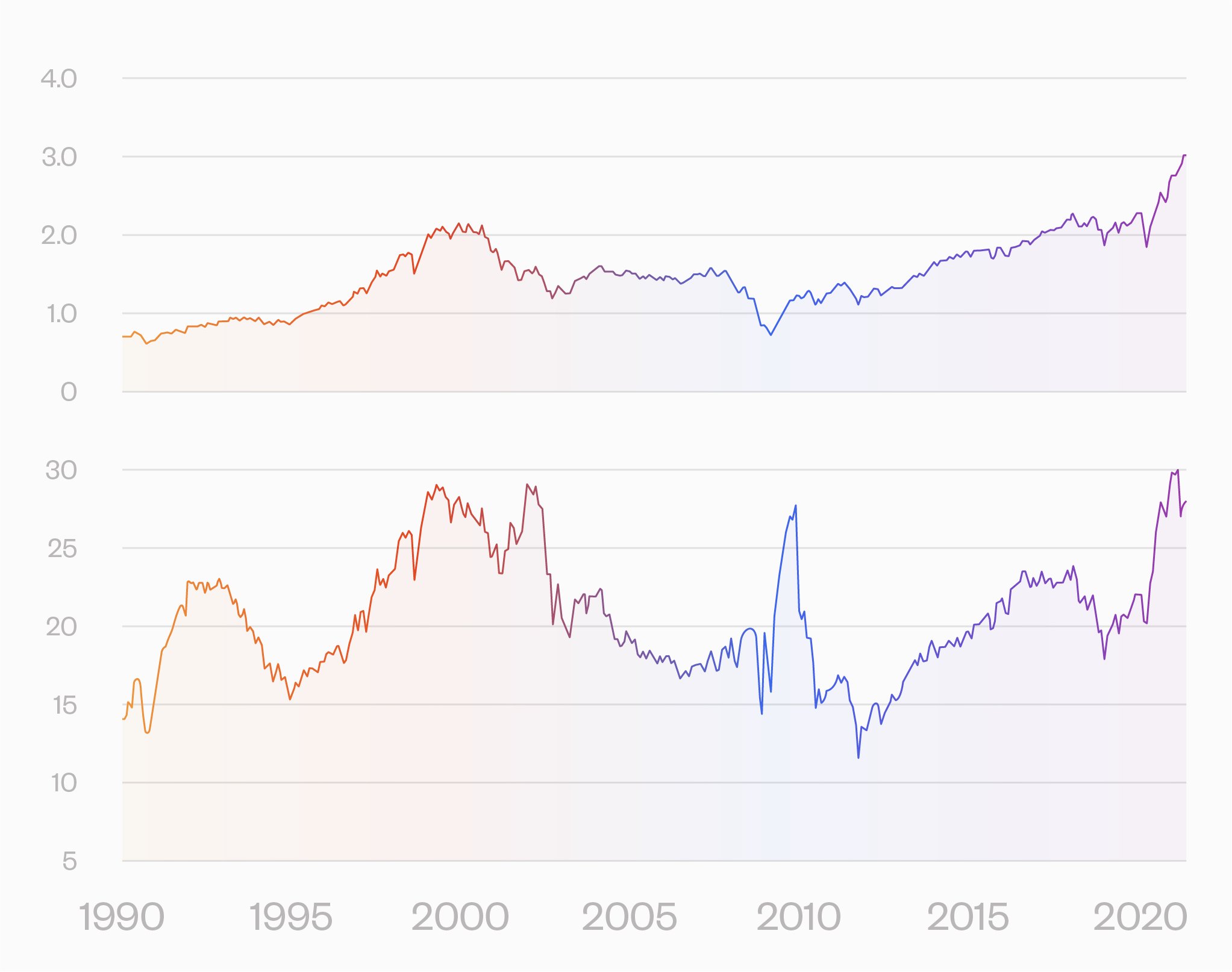
The usual measures are not too great. Here is a chart showing the median price vs. sales (top) and price vs. operating earnings (bottom) for the S&P 500. Both at or near record highs. Any number of other valuation measures are at historic highs. Market cap vs. GDP as one example.

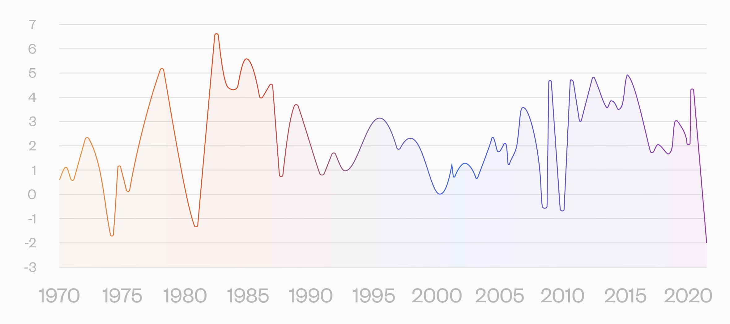
Bad enough, but if we adjust earnings for inflation to look at real earnings, we are in uncharted territory. This chart shows smoothed inflation-adjusted earnings yield.

It is below the 2000 and 2008 levels, even below the worst levels during the 1970's, when there was a huge inflation tailwind.
The counterargument is that with low rates, discounted future earnings count for more. But as I have argued elsewhere, this Finance 101 approach to valuation works for a class assignment, but not for serious valuation. The risk premium on earnings looking out 20 years is going to dominate the effects of an interest rate that is a percent or so lower than the recent past.
Thanks to Ned Davis for highlighting the real earnings yield.
Access a better way to understand and work with risk, powered by MSCI’s factor model.

Rick Bookstaber
CO-FOUNDER AND HEAD OF RISK
Rick Bookstaber has held chief risk officer roles at major institutions, most recently the pension and endowment of the University of California. He holds a Ph.D. from MIT.
Access a better way to understand and work with risk, powered by MSCI’s factor model.
Recommended Articles

JANUARY 6, 2022
7 Things Bitcoin Fans Say—and Why This Risk Expert Says They’re Wrong
Read More

JANUARY 6, 2022
7 Things Bitcoin Fans Say—and Why This Risk Expert Says They’re Wrong
Read More

JANUARY 6, 2022
7 Things Bitcoin Fans Say—and Why This Risk Expert Says They’re Wrong
Read More
© 2022 Fabric Risk
